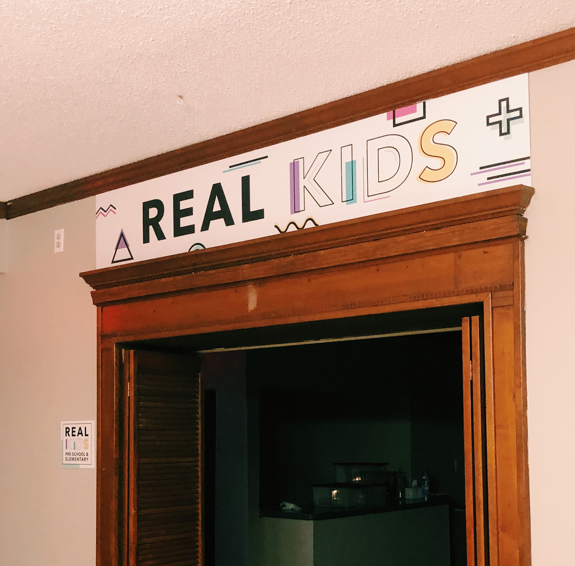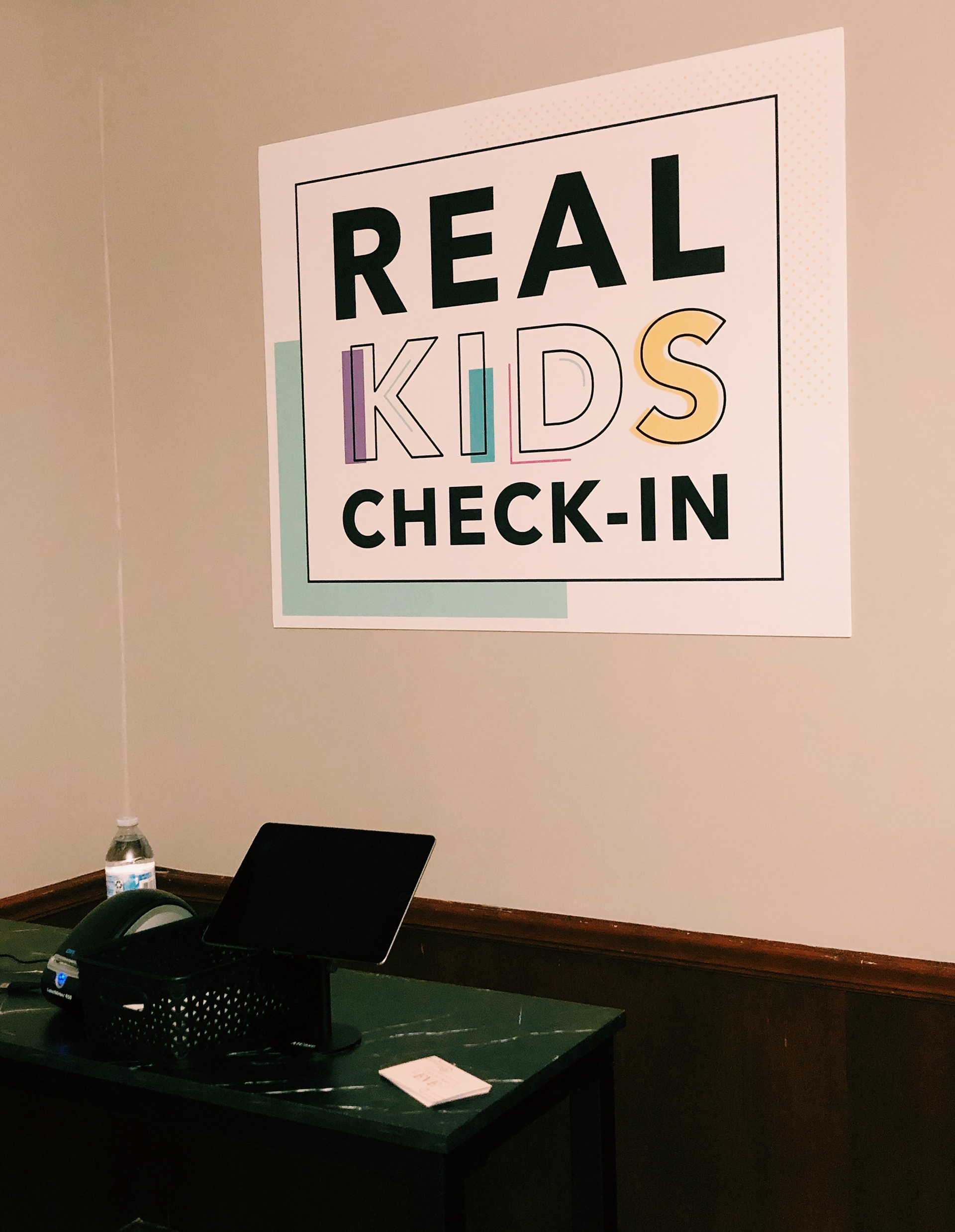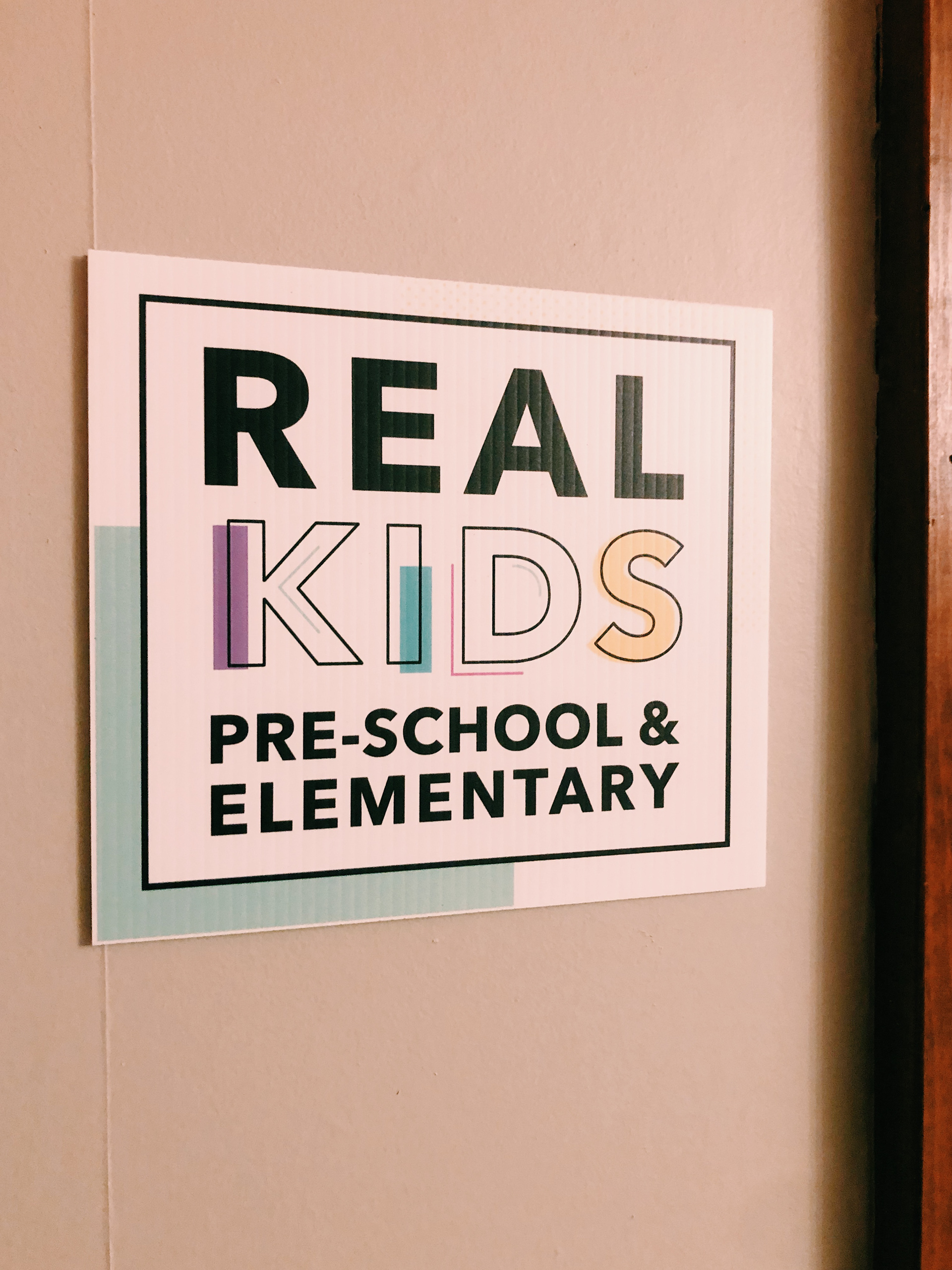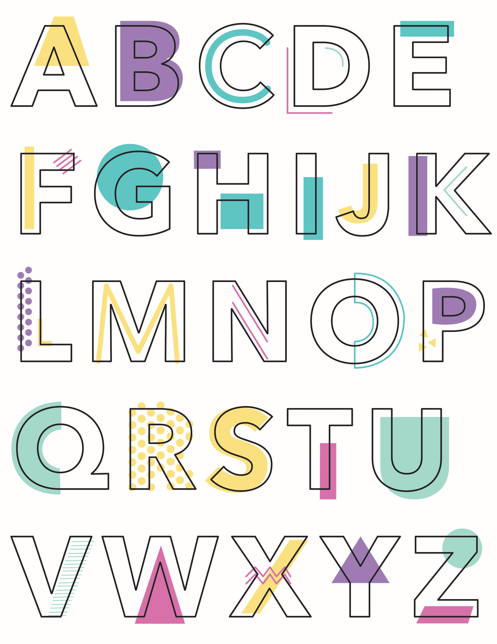
This was a branding project I did for REAL Church and their children's ministry. I wanted to keep the integrity of the church's brand but bring in some fun, memphis style elements to make it more attractive, fun and recognizable as a children's ministry. I also created a whole alphabet to follow the "KIDS" in the logo so it can be used further in the branding.